|
| Composition and dSLRs |
The SLR View
Focus
Coverage and Magnification
Layout Aids
Aspect Ratios
Basics of Composition
Understanding Your Intent
Simplicity
Finding Your Center
Visual Orientation
Rule of Thirds
Linear Thinking
Balance
Framing
Fusion/Separation
Composing with People
Lighting
Posing
Landscape Photography
Architectural Photography
Shooting Outdoors
Shooting Indoors
TradeBonanza - Trader's Daily Digest | Financial Comic Strips |
Composition and dSLRs
There’s a big difference between taking a picture and making a picture. Even if you’re using a digital SLR, there are times when you’ll take a grab shot, bringing the camera to your eye to catch a fleeting moment and relying, mostly, on instinct to frame and compose your image a split second before you press the shutter release. If your camera’s autofocus and autoexposure mechanisms do their stuff, you can end up with a fine photograph, despite a shooting technique that’s not far removed from a point-and-shoot impulse shot. Some great pictures, including more than a few Pulitzer Prize winners, were taken on the spur of the moment without a great deal of planning.
For example, you’ve surely seen the chilling photograph of a woman falling 11 stories from a burning Atlanta hotel in 1946. The 26-year-old Georgia Tech student and amateur photographer captured the shot using his very last flashbulb, certainly took the picture on the fly (so to speak), and earned a Pulitzer Prize and $500 for his effort. Memorable pictures can be taken without careful attention to the technical and artistic aspects.
Yet, if you enjoy photography, you’ll want to spend as much time making an image as taking a photo. Ansel Adams spent figurative eons awaiting the perfect weather conditions and conjunction of the moon, planets, and stars to make his legendary images (and then spent additional time carefully crafting the result in the dark room). You probably won’t work with such deliberation, but, in general, if you spend a few moments or seconds contemplating your picture, you’ll end up with better results from both a technical and compositional standpoint. Digital SLRs offer the most control over composition because they show exactly what will be imaged in the digital file. However, sometimes what you see may not be what you get. This section looks at that aspect and provides some basic information on composition. Then, we’ll apply these rules to several of the most common picture-taking situations, ranging from portraiture, to architectural photography, to landscapes and a few other types.
If you want a more complete look at these particular genres, you’ll want to check out some other stuff at the internet, which has a full explanation devoted to each of them.
|
| Back to top |
The SLR View
You learned how SLR viewfinders work Digital SLR Technology and Quircks and Strength sections. Now it’s time to see how the SLR view applies to composing your photos.
As you know by now, a dSLR shows you through the viewfinder exactly what you’re going to get in your finished image, right? Or does it? I explained some of the dSLR’s viewfinder anomalies earlier in this site, but didn’t cover all of them as they apply to picture making. The next sections provide a checklist to consider.
Focus
Your dSLR’s viewfinder will generally show you what portion of the image is in sharpest focus, as an aid for manual focusing, or as a double-check as to whether your autofocusing mechanism has correctly recognized the distance of your primary subject. You can use this view to make a manual correction, or change to a different focus area or method (usually simply by pressing a button or key).
However, unless you’ll be shooting the final picture at the maximum, wide-open f-stop, what is actually in focus in your finished image may differ sharply from what you saw in the viewfinder. Keep these points in mind:
■ The view through the viewfinder is shown at the lens’ maximum aperture, which has the least depth-of-field. So, it’s more likely that areas of the image not in the primary plane of focus will appear less sharp and more blurry in this view.
■ The actual picture may be taken at a smaller f-stop, which provides more depth-of-field, so the final photo may be very different from what you saw through the viewfinder.
■ Depth-of-field can be important in applying selective focus as a creative tool (making parts of the image blurry to isolate the main subject in the image), so the difference between what you saw and what you got can be crucial.
■ If you’re used to working with point-and-shoot digitals, you’re probably accustomed to the massive depth-of-field their shorter focal lengths provide and may not be aware of the pitfalls and advantages of the shallower depth-of-field offered by some dSLR camera/lens systems.
■ The longer the focal length or zoom setting used, the less depth-of-field you’ll have at wide open apertures, which may make the increased field of sharpness at smaller f-stops have even more of an impact on your finished work.
As I noted, point-and-shoot digital cameras don’t have this problem. Everything is more or less in focus from a few feet out to infinity, so depth-of-field isn’t a factor unless you’re taking closeup pictures. In addition, the optical viewfinders of a point-and-shoot camera don’t show depth-of-field at all, and while the digital LCD of such cameras may indicate what portions of the image are in focus, they’re usually too small to see the exact planes of focus clearly.
Digital SLRs, with their longer lenses, introduce all the depth-of-field considerations described previously. How do you determine whether or not the areas you want to be in focus are in focus, and the parts of the image that you want to be blurry are, in fact, blurry? Experienced photographers allow their past shooting results to guide them somewhat; they know, roughly, what is going to be sharp and what is going to be out of focus. However, experienced photographers are also likely to use their dSLR’s depth-of-field preview button to get an idea of what depth-of-field is going to be ahead of time. Or, they make take a quick glance at the colorcoded depth-of-field scale printed on the barrels of many older lenses.
What? You’ve never used this control? If you’re new to dSLR photography, you might have to look in your manual to find the depth-of-field preview button. It’s usually located somewhere near the lens mount. When you hold this button down, the lens stops down to the current taking aperture and provides you with a more-or-less accurate view of your effective depth-offield.
The accuracy of this view can be affected by the type of focusing screen used in your camera, how well you can see the image (which will be darker and less easy to view when the lens aperture is partially closed), and whether or not you’ve adjusted the diopter setting of your eyepiece to provide a sharp, clear view of the focus screen.
Coverage and Magnification
I described the dSLR anomalies involving coverage and magnification in Quircks and Strength section, but they bear mentioning again here. Your viewfinder may not show the entire area that will be captured in the finished image, but, generally, you’ll get more image area, rather than less, so this should not be a problem. If you find extraneous image area that detracts from your composition, you can always crop it out.
The magnification factor impacts your images only to the extent that lack of magnification in your viewfinder (generally, anything less than about 75 percent) makes it more difficult to view details and compose your image precisely.
Layout Aids
Some dSLRs have optional grids or other layout aids, as shown in figure below, that can be invoked to make it easier to compose your image in the viewfinder. Film SLRs have long had special focus screens with grids, cross-hairs, framing marks, and other such aids. You’ll find them useful for helping you line up the horizon for landscape photographs, positioning buildings and other structures in your viewfinder for architectural shots, or even for lining up the family crew for group portraits.
However, the viewfinders of some dSLRs may not be precisely aligned. This may be particularly true for entry-level, consumer-oriented digital SLRs for which viewfinder precision is not a high priority. It’s entirely possible that, no matter how carefully you line up the horizon in your scenics, you’ll find that it’s askew in your finished photo. You can always fix this in your image editor, or even create an image editor macro command (called an Action in Photoshop) to rotate your pictures the exact amount needed to correct his. Or, you can learn to tilt your camera a bit to the side.
Or you can ignore the problem because for many types of pictures, it’s not a big deal. Just be aware of it, and be prepared to work with or around it. 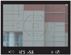
Aspect Ratios
Finally, you’ll want to consider that the proportions of your viewfinder’s layout, while they will conform to the proportions of your sensor’s dimensions, may not coincide with the dimensions of your intended finished output. For example, if you’re shooting with a full frame dSLR, the aspect ratio of your viewfinder and final image will be proportional to the 36mm × 24mm frame of a 35mm film camera, or 1.5:1. Or, perhaps your camera’s sensor produces images that are 3008 pixels wide and 2000 pixels tall, roughly the same 1.5:1 ratio (more commonly referred to as 3:2 in the digital camera world).
Neither aspect ratio traditionally fits well with most print sizes, particularly 4 × 5 or 8 × 10 inch prints, and doesn’t even exactly fit intermediate sizes, such as 5 × 7 or 11 × 14 inches. It’s likely that your digital camera produces pictures that will have to be cropped at either or both ends when you make hard copies, or else you’ll need to leave a wide white border at top and bottom, wasting paper. You need to keep this disparity in mind when composing your photos and making prints. |
| Back to top |
Basics of Composition
Except for the factors listed above, composition with digital SLRs proceeds much as it does with any other type of photography. You can move around, change your angles, get closer or farther away (within practical constraints), and otherwise alter your perspective enough to vary your compositional choices before you ever bring the camera to your eye. You can also ask your living subjects to move around, or you may physically relocate objects that are movable, such as rocks, debris, undesired automobiles in the background, and so forth. Then, you can use your lenses to refine the area included in your photo, changing focal lengths or zooming in or out to narrow or expand your field-of-view. If anything, the dSLR owner has a leg up on other digital camera photographers because the digital SLR has a wider range of lenses available than can be found on the most ambitious point-and-shoot or EVF models, which are generally limited to 12X zooms, and focal lengths from about 28mm to 340mm (35mm equivalent).
Of course, you might find yourself in situations where your compositional flexibility is severely limited. A soccer team is not going to stop and pose for you, nor even arrange itself in a pleasing composition at your suggestion. If you happen to catch Colin Farrell on his way out of a restaurant, he might stop and pose for a quick photograph, or he might not. You might yearn for a closer vantage point to capture that stunning volcanic eruption in the distance, but getting closer might not be practical. You’d love to photograph the façade of a 15th century cathedral, but even with your most expansive wide-angle lens, you find yourself backed up against a 21st century vegetable stand set up in the plaza across the street.
In most cases, though, you’ll have enough leeway to compose your shots the way you want them.
Then, you’ll want to follow these Nine Simple Rules for composing photos effectively.
■ Understanding your intent.
Before you snap the picture, you need to know what your intent is. Are you telling a story? Making a statement? Trying for humor? Capturing a warm, emotional moment? The kind of photograph you’re taking can affect how you compose the image. For example, preserving an intimate moment calls for a very tight composition with no distracting elements. One designed to show the majesty of a scenic landscape may call for a broader, more inclusive composition.
■ Simplicity.
Most effective compositions call for including only the elements that are needed to illustrate your idea. By avoiding extraneous subject matter, you can eliminate confusion and draw attention to the most important part of your picture.
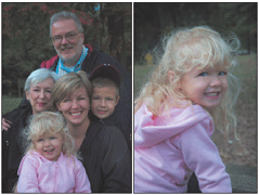
■ Choosing a center.
Your photos should always have just one main subject that captures the eye. The left and center figure below show how simply zooming in can improve a composition.
■ Selecting an orientation.
Some images look best in vertical orientation, as you can see in the right figure below. Others look best composed in horizontal landscape mode. You need to decide which view to use.
■ The Concept of Thirds.
Placing interesting objects at a position located about one-third from the top, bottom, or either side of your picture makes your images more interesting than ones that place the center of attention dead-center (as most amateurs tend to do).
■ Lines.
Objects in your pictures can be arranged in straight or curving lines that lead the eye to the center of interest, often in appealing ways.
■ Balance.
We enjoy looking at photographs that are evenly balanced with interesting objects on both sides, rather than everything located on one side or another and nothing at all on the other side.
■ Framing.
In this sense, framing is not the boundaries of your picture but, rather, elements in a photograph that tend to create a frame-within-the-frame to highlight the center of interest. The right figure also shows the use of parts of an image to create a series of frames, each bounding the next part of the reducing geometric pattern.
■ Fusion/Separation.
When creating photographs, it’s important to ensure that two unrelated objects don’t merge in a way you didn’t intend, as in the classic example of the tree growing out of the top of someone’s head. 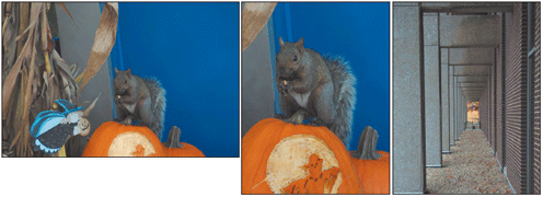
Understanding Your Intent
Are you taking a portrait, a sports photo, or attempting to capture amber waves of grain in a scenic masterpiece? The kind of picture you want to take can have a dramatic affect on your composition. High-school portraits might include props, from iPods to tripods, to indicate the teenager’s lifestyle or avocations. Your sports photo may require a high angle or an up-close and personal viewpoint to portray the action.
Something as simple as a scenic photo can be affected by your intent. If you’re photographing the Grand Canyon, you might want to emphasize the grandeur of the chasm with a wide-angle lens. But if your intent is to show the environmental impact of humans on this ageless masterpiece of nature, your composition might possibly include trash left behind by some careless visitors.
Perhaps you’re looking for some humor, as shown below. There are as many different motives for a photograph as there are photographs to be taken. Once you understand the intent of your photo, you’re in a better position to understand the needs of your composition.

Simplicity
The old saw says that fine sculptures start with a block of marble, from which everything is subtracted that doesn’t look like the finished subject. The same is true of photographs. Exclude everything that doesn’t belong in your picture, including cluttered backgrounds, extra people, or extraneous objects. You might want to stick with a plain or neutral background, or one that helps tell the story. A portrait might rely on a seamless paper or textured background, or, for a politician, include a wall of law reference books or a flag. A soldier returning from battle might be pictured up close, with little or no background at all, or shown surrounded by debris and crumbled buildings.
In composing your shots with simplicity in mind, crop out unimportant objects by moving closer, stepping back, or using your zoom lens. Remember that a wide-angle look emphasizes the foreground, adds sky area in outdoor pictures, and increases the feeling of depth and space. Moving closer adds a feeling of intimacy while emphasizing the texture and details of your subject. A step back might be a good move for a scenic photo; a step forward a good move for a photograph that includes a person.
Even if you’re working with an 8–16 megapixel camera, careful cropping means you have more pixels to work with in your image editor. The more you crop in your camera, the better image quality you’ll end up with. But don’t go to extremes and cut off heads. Remember that with a digital camera, careful cropping when you take the picture means less trimming in your photo editor, and less resolution lost to unnecessary enlargement. Finally, when eliminating “unimportant” aspects of a subject, make sure you really and truly don’t need the portion you’re cropping. For example, if you’re cropping part of a boulder, make sure the part that remains is recognizable as a boulder and not a lumpy glob that viewers will waste time trying to identify. And cutting off the heads of mountains can be just as bad as cutting off a person’s head in a portrait.
Finding Your Center
Find a single center of interest. It doesn’t have to be in the center of your photograph (and in most cases shouldn’t be) but it should be the most important subject in your picture. The viewer’s eye shouldn’t have to wander through your picture trying to locate something to look at. The center of interest should be the most eye-catching object in the photograph; it may be the largest, the brightest, or most unusual item within your frame.
Avoid having more than one main center of attention. You can have several centers of interest to add richness and encourage exploration of your image, but there should be only one main center that immediately attracts the eye. Include other interesting but subordinate things in your photograph, but they should be subordinate to the main subject.
Visual Orientation
Photographs can be composed using a tall, vertical, portrait orientation, or a wide, horizontal, landscape orientation. The biggest mistake beginners make (aside from not getting close enough) is to shoot everything horizontally. As a dSLR photographer, you probably don’t have this problem, but may still be tempted to shoot more photos than you need to in landscape mode, particularly if your particular camera doesn’t have a comfortable vertical grip with a separate shutter release button making that orientation natural and easy to use. You might also want to turn on your dSLR’s auto-rotate feature so your vertical shots automatically will be displayed on-screen upright (although this tends to make the image smaller and more difficult to evaluate).
Still, you won’t want to shoot a tall building or an NBA player in landscape orientation, nor will you want to take pictures of sweeping scenic expanses in vertical orientation—unless you plan to use our natural viewing bias as a creative element. Square compositions tend to be static and are not used much (which means you ought to try some square compositions as a creative exercise).
Rule of Thirds
Every book I’ve written on photography mentions the concept of dividing your images into thirds. It’s a useful guideline, but you probably shouldn’t fear breaking this “rule” frequently. Like many rules of conventional wisdom, the Rule of Thirds is sometimes more conventional than wise.
It derives from the idea that placing subject matter off-center is usually a good idea. Things that are centered in the frame tend to look fixed and static, while objects located to one side or the other imply movement because they have somewhere in the frame to go. If you follow the rule of thirds, you’ll divide your picture area into a grid with pairs of imaginary horizontal and vertical lines placed about one-third of the distance from the borders of the frame. The intersections of these lines create four points where you might want to place your center of interest. You don’t have to position your subject exactly at one of these points; just use them as a guideline, as shown below. Other interesting things in the photo can be positioned at any of the other three points.
You can use these gridlines in many ways besides locating a center of interest. For example, in landscape photos you might want to place the horizon at the lower-third grid line if you want to emphasize the sky, or at the upper-third grid line if the important parts of your composition are in the foreground and distance. (Horizons should rarely be placed in the exact middle of the photograph.) 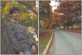
Linear Thinking
Lead your viewer to your center of interest through the use of straight or curved lines, as well as strong geometric shapes. Vertical and horizontal lines force our attention up, down, or side to side, while diagonals lead the gaze from one bottom corner to the top opposite corner of the picture (for various reasons, we don’t usually follow a diagonal line from top to bottom). Curved lines are most pleasing of all. Your lines can consist of parts of the image such as fences, roads, skylines, or other components. Look for natural lines in your subjects and use them in your composition.
Balance
Your images should have a balanced arrangement of shapes, colors, lightness, and darkness so your picture doesn’t have a lopsided look. That doesn’t mean your photograph must be perfectly symmetrical. You can have a larger, brighter, or more colorful object on one side balanced by a smaller, less bright, or less colorful object on the other.
Framing
Framing is a technique of using objects in the foreground to create an imaginary picture frame around the subject. A frame concentrates our gaze on the center of interest that it contains, plus adds a three-dimensional feeling. A frame can also be used to give you additional information about the subject, such as its surroundings or environment.
You’ll need to use your creativity to look around your subject to find areas that can be used to frame your subject. Windows, doorways, trees, surrounding buildings, and arches are obvious frames. Frames don’t even have to be perfect or complete geometric shapes. Generally, your frame should be in the foreground, but with a bit of ingenuity you can get away with using a background object, such as the bridge, as a framing device.
Fusion/Separation
Our vision is three-dimensional, but photographs are inherently flat, even though we do our best to give them a semblance of depth. So, while that tree didn’t seem obtrusive to the eye, in your final picture it looks like it’s growing out of the roof of that barn in your otherwise carefully composed scenic photograph. Or, you cut off the top of part of an object, and now it appears to be attached directly to the top of the picture.
You always need to examine your subject through the viewfinder carefully to make sure you haven’t fused two objects that shouldn’t be merged, and have provided a comfortable amount of separation between them. When you encounter this problem, correct it by changing your viewpoint, moving your subject, or by using selective focus to blur that objectionable background. |
| Back to top |
Composing with People
Composing your photographs with people is a special challenge, if only because every person pictured will end up being a critic of your work. Yet, digital cameras in general, and dSLRs in particular are perfect tools for shooting people. You can immediately check your picture to make sure no one had her eyes closed, or happened to look away from the camera, or, perhaps, had a stray pen peeping out of a shirt pocket. When you’re done, you can show your photographs to your victims, and perhaps ensure they’ll pose for some more pictures.
When shooting formal, informal, or candid portraits, you’ll want to have a camera with as many megapixels as possible to give you the most flexibility when it comes time to retouch your images or make enlargements for display. You’ll also need a modest zoom lens or prime lens of equivalent focal length, in the 80mm-to-100mm range for individual or small group portraits, and 50mm or wider for larger groups. These are absolute focal lengths I’m talking about, not multiplication factor equivalents. Remember that the lens multiplication factor is a cropping factor, not a true focal length. So, because 80mm to 100mm lenses provide the most attractive perspective for portraits, that’s what you’ll need with your digital SLR, even though your camera crops the lens’ view internally. You might have to step back a bit or use a slightly shorter lens (70mm to 80mm instead of 100mm).
Lighting
You also should consider using external lights, whether incandescent or, preferably, electronic flash (because flash is better for moving subjects, like people, plus it’s more comfortable for your subjects than hot lights). Erect a plain background indoors, or incorporate the natural indoor or outdoor background into your composition, if it’s uncluttered. If you’re using electronic flash, you probably won’t need a tripod, unless you want to take a series of pictures using the same fixed point of view. If you’re using incandescent lights, you may need a tripod to steady the camera for longer exposures. In some shooting environments, the existing illumination may work perfectly fine, particularly if you have some reflectors to use to soften dark shadows. Overcast days provide a nice, diffuse light, too.
The quality of the light you use is also important. Soft, flattering lighting is better than harsh illumination when photographing people. It softens wrinkles and facial defects and makes for a more attractive photo. Even a grizzled old-timer proud of the character lines on his or her face will look better if the light is a little softer. Conversely, the silky-soft smooth skin of a newborn babe can look blotchy under harsh lighting. If you’re using electronic flash, umbrellas are good choices as reflectors to soften the light.
Using several lights or light sources will let you use light to provide shape and form to faces and figures. Most photographers use a main light to illuminate the face, accompanied by a fill light to soften shadows, perhaps a hair light to add a little sparkle to the hair, and a background light to separate the subject(s) from the background.
There are a number of standard lighting arrangements for these multiple light sources, perhaps you'll want to check out some other sources for detail explanation.
Here’s a quick summary:
■ Short lighting.
This is a form of three-quarter lighting, with the face turned to one side so that three quarters of the face is turned toward the camera, and one quarter of the face is turned away from the camera. The main light illuminates the side of the face turned away from the camera, and because three-quarters of the face is in some degree of shadow and only the “short” portion is illuminated, this type of lighting tends to emphasize facial contours, portraying a face as narrower than it really is. You can see short lighting and its complement, broad lighting, below.
■ Broad lighting.
This is the flip side of the three-quarter lighting coin, with the main light illuminating the side of the face turned toward the camera. The soft main light de-emphasizes facial textures and widens narrow or thin faces.
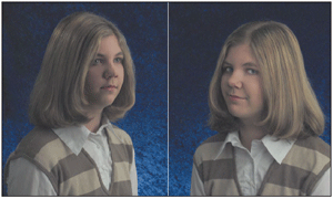
■ Butterfly lighting.
This is a type of glamour lighting effect, with the main light placed directly in front of the face above eye-level, casting a shadow underneath the nose. This is a great lighting technique to use for women because it accentuates the eyes and eyelashes, and emphasizes any hollowness in the cheeks, sometimes giving your model attractive cheekbones where none exist. Butterfly lighting de-emphasizes lines around the eyes, any wrinkles in the forehead, and unflattering shadows around the mouth. Women love this technique for obvious reasons. Butterfly lighting also tends to emphasize the ears, making it a bad choice for men and women whose hairstyle features pulling the hair back and behind the ears. You can see an example of this kind of lighting in figure below.
■ Rembrandt lighting.
This is a flattering lighting technique, also shown in the figure below, that is better for men. It’s a combination of short lighting and butterfly lighting. The main light is placed high and favoring the side of the face turned away from the camera. The side of the face turned towards the camera will be partially in shadow, typically with a roughly triangular shadow under the eye.
■ Side lighting.
This is a kind of lighting with the illumination coming primarily directly from one side. You can place the main light slightly behind the subject to minimize the amount of light that spills over onto the side of the face that’s toward the camera.
■ Backlighting.
Backlit photos have most of the illumination coming from behind the subject, defining its edges. Use additional fill light to provide for detail in the subject’s front.
Outdoors, you can use these same lighting techniques, but work with the available light, reflectors, or perhaps some fill flash provided by your camera’s built-in strobe. 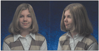
Posing
Your subjects will look more natural if you pose them comfortably so they’re not stiff or awkward. Let them sit comfortably if you can. A stool is a good seat because there is no back to intrude into the photograph and it discourages slouching. If you’re posing a group, you may want several stools of different sizes to arrange your subjects in a pleasing composition, or arrange them as in left figure below, so the heads of each individual are at different levels in the photograph. Outdoors, you can find comfortable seats in the form of logs, rocks, picnic tables, and other objects.
If you’re photographing an individual, you can try different poses as you work. When working with young children, you may have to make a game of the session to put them at ease and enjoy posing for the camera. For the right figure, I asked the young lady to sit on a picnic bench facing away from me; then look toward the camera over her shoulder.
For group pictures, you’ll probably want to try and arrange everyone in a pleasing way and take several sets of pictures with each pose before moving on. Use basic compositional rules to arrange your subjects. Vary your camera’s viewpoint slightly to portray your subject in a more flattering way. For example, raise the camera slightly above eye-level if you want to elongate a nose or narrow a chin, broaden a “weak” forehead or de-emphasize a prominent jaw line. If your subject has a wide forehead, long nose, or weak chin, lower the camera a little. If you encounter someone with a strong jaw and long nose, however, you’re in a heap of trouble.
Remember that the edges of hands are more attractive than the backs or palms, and bare feet should be avoided entirely, particularly the bottoms thereof. While bald heads are almost a fashion accessory these days, you can minimize a shiny pate by having your subject elevate his chin while you lower the camera bit. Faced with a subject with a large or angular nose, have your victim face directly into the camera to avoid a profile shot of the schnozz. Prominent ears can be minimized by shooting in profile, or taking a three-quarters shot with the nearest ear in shadow.
Wrinkles or scars can be hidden with softer light. Bad reflections off glasses can often be eliminated by having your subject raise or lower his or her chin slightly, as shown below.  |
| Back to top |
Landscape Photography
Digital SLRs are great for landscape photography because you can usually fit them with wider lenses than those available for point-and-shoot and other digital camera. I paid a bundle for my 12mm–24mm zoom lens, but it’s paid for itself over and over when I’ve shot scenic pictures. Some kinds of scenics call for longer lenses, too, so that 200mm or longer optic will come in handy when you can’t drive a few miles closer to that erupting volcano.
Other than an occasional tripod and use of a self-timer or remote control so you can get into the picture yourself, landscape photos are remarkably gadget-free. You’ll seldom need an electronic flash, unless you’re taking night photos or want to “paint with light” in a time exposure (this technique is a special project in my book Mastering Digital Photography). Your dSLR, a few lenses, and lots of digital memory cards are all that you need to take great pictures. Scenic photos fall into several types of compositions. These include:
■ Mountains and other vistas.
This kind of picture embraces your typical stunning panorama views, whether captured in panorama mode or not. Generally, groups of people, buildings, and, frequently, even animals are absent from this kind of photograph. Your composition will depend heavily on your choice of lens focal length. A wide-angle view makes distant objects appear to be farther away, emphasizing the foreground of your photo. A longer telephoto setting brings far away objects like mountains closer, but compresses everything in the foreground.
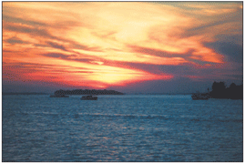
■ Sunsets and sunrises.
These are popular subjects because they’re beautiful, colorful, and often look as if a lot of thought went into them even if you just point the camera and fire away. Your digital SLR may even have a Sunrise or Sunset white-balance control, or programmed exposure mode especially suited to this kind of picture. Experiment with darker, silhouette-heavy images, and watch out for glare caused by the sun. Consider using a star filter or gradient filter to add a special effect or even the exposure between the brighter sky and darker foreground. And don’t forget to work fast: Sunrises and sunsets can be over in a few minutes. This figure shows a sunset captured at just the right moment.
■ Sea and water scenes.
Moving water can be captivating, but you’ll need to monitor your exposure carefully. Bright sand and reflective water can fool your exposure meter. Experiment with incorporating reflections in the water into your compositions. Or, use a neutral density filter and a long exposure to blur the water while the surrounding shoreline and rocks remain sharp.
■ Snow scenes.
Snow photos are a lot like sea and beach images from the standpoint of the possibility for glare and underexposures caused by improper metering. You’ll also need to be wary of condensation and poor battery performance caused by cold temperatures. |
| Back to top |
Architectural Photography
Architectural photography is another contemplative form of photography (most of the time) because it involves structures that will happily pose for you for hours on end without complaining.
Of course, architecture is often accompanied by humans who can add or detract from the composition, and by changing weather conditions. It’s a lot of fun, though, and well suited for digital SLRs because the larger sensors on these cameras, compared to point-and-shoot models, makes them more suitable for long exposures at night (which is one of the most interesting kinds of architectural photography).
Shooting Outdoors
Because the best structures are often surrounded by other buildings, you’ll need a wide-angle lens or zoom equipped with a fairly wide-angle setting for your outdoors shots. Indoors, the wider, the better, unless you’re shooting inside the Superdome or a towering cathedral. A wide lens will help you incorporate foreground details, such as landscaping, into your compositions.
A fast lens with a maximum aperture of f2 will help you capture images under difficult lighting conditions. Architectural photos are often very carefully composed, so you might find yourself working with a tripod frequently, not so much to steady the camera as to provide a perspective that changes only when you want it to.
The things to watch out for are various distortions. One type is caused by lenses themselves. Certain wide-angle optics are known to be blurry in the corners of the image, mostly because filling the entire frame with a wide perspective taxes the coverage of even expensive dSLR lenses. Or, your lens can produce barrel distortion, in which the straight lines are bowed outwards toward the edges of the photo, or pincushioning, with lines that curve inward towards the center.
Unless you’re photographing barrels or pincushions, neither condition is desirable. Your lens may have one of these defects, although probably not dramatically, which would make it less than ideal for architectural photography. Test your lens by photographing a grid and then visually looking to see if the vertical and/or horizontal lines bow in or out. Andromeda makes a Photoshop-compatible plug-in called LensDoc that not only can correct for both kinds of distortion, but has built-in corrections for the tested distortion already found in some common Canon, Nikon, and Olympus digital camera lenses.
Another kind of distortion is called perspective distortion, and it is produced when the camera is tilted up or down to photograph a tall building or other vertical structure. Tilting the camera lets you take in the top of the structure, but then the subject appears to be falling back, as you can see in Figure 9.18. The same thing happens when you angle the camera to either side to grab a picture of a receding object, such as a stone wall, but the results aren’t as apparent or, usually, as objectionable. The most obvious solution—to step backwards far enough to take the picture with a longer lens or zoom setting while keeping the camera level—isn’t always available.
One workaround, if you’re lucky, is to locate a viewpoint that’s about half the height of the structure you want to photograph, with no intervening buildings, flagpoles, or other objects in between. Shoot the picture from that position, keeping the back of the camera parallel with the structure, and both the top and base of the building will be roughly the same distance away from the camera. You’ll get a much more natural-looking picture. Finally, you may be able to adjust the perspective of your image in your image editor.
If you find that shooting the exterior of a building is difficult from a perspective viewpoint, consider capturing parts of the structure, such as doorways, entrances, roofs, or decorations. These details may tell you more about the building or monument than an overall view would.
Cobblestone steps on a 15th century palace, worn by the incessant pounding of human feet or the weathered siding on an old barn can express ideas effectively when incorporated into your compositions. 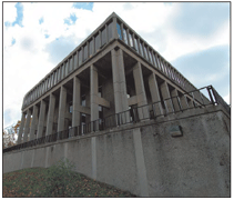
Shooting Indoors
Indoor architectural photography is particularly challenging. Your widest wide angle may not be wide enough, and your fastest f-stop or ISO setting may not provide sufficient exposure.
The natural lighting indoors is likely to be less attractive in photographs than it appears in real life, is probably uneven, may be harsh, and can even involve tricky combinations of bluish daylight streaming in the windows to mix with orangish incandescent illumination.
A tripod and a long exposure may help, and let you use a lower ISO setting with less noise, to boot. Or, if you have a modicum of control over the lighting used, you may be able to add more lighting, soften additional lighting, or use reflectors to distribute the available illumination. If the lighting is mixed, match daylight with electronic flash, or close the blinds to confine the illumination to the interior incandescent lights. |
| Back to top |
|